
clip 属性定义了元素的哪一部分是可见的。clip 属性只适用于 position:absolute 的元素。
警告: 这个属性已被废弃。建议使用 clip-path
文档
- https://developer.mozilla.org/zh-CN/docs/Web/CSS/clip
- https://developer.mozilla.org/zh-CN/docs/Web/CSS/clip-path
(目录)
语法
/* 标准语法 */
clip: rect(<top>, <right>, <bottom>, <left>);

/* 向后兼容语法 */
clip: rect(<top> <right> <bottom> <left>);

/* 默认值。不应用任何剪裁 */
clip: auto;

/* 从父元素继承 clip 属性的值 */
clip: inherit;
- top 和 bottom 指定相对于盒子
上边框边界的偏移 - right 和 left 指定了相对于盒子
左边框边界的偏移
截取各个边框
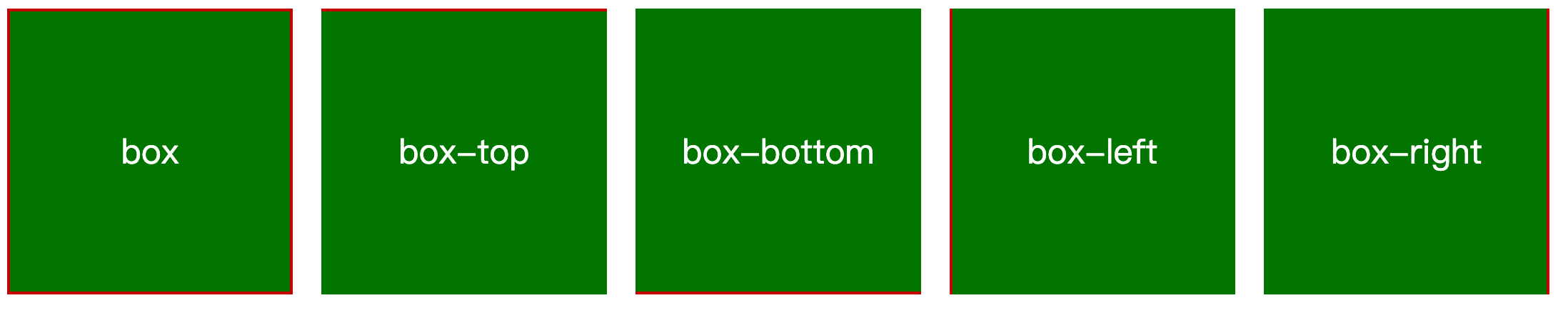 实现代码
实现代码
<style>
  .box-wrap {
    display: flex;
    column-gap: 20px;
  }

  .box {
    position: relative;
    height: 200px;
    width: 200px;

    background-color: green;
    color: #fff;
    font-size: 24px;
    text-align: center;
    line-height: 200px;
  }

  .box::before {
    content: "";
    position: absolute;
    left: 0;
    top: 0;
    right: 0;
    bottom: 0;
    border: 2px solid #cd0000;
  }

  .box-top::before {
    /* 上边框 */
    clip: rect(0 200px 2px 0);
  }

  .box-bottom::before {
    /* 下边框 */
    clip: rect(198px, 200px, 200px, 0);
  }

  .box-left::before {
    /* 左边框 */
    clip: rect(0, 2px, 200px, 0);
  }

  .box-right::before {
    /* 右边框 */
    clip: rect(0, 200px, 200px, 198px);
  }
</style>

<div class="box-wrap">
  <div class="box">box</div>
  <div class="box box-top">box-top</div>
  <div class="box box-bottom">box-bottom</div>
  <div class="box box-left">box-left</div>
  <div class="box box-right">box-right</div>
</div>
实现Loading加载效果边框
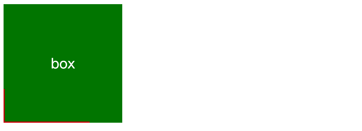
实现代码
<style>
 .box {
    position: relative;
    height: 200px;
    width: 200px;

    background-color: green;
    color: #fff;
    font-size: 24px;
    text-align: center;
    line-height: 200px;
  }

  .box::before {
    content: "";
    position: absolute;
    left: 0;
    top: 0;
    right: 0;
    bottom: 0;
    border: 2px solid #cd0000;
    animation: borderAround 1.5s infinite linear;
  }

  @keyframes borderAround {
    0%,
    100% {
      clip: rect(0 200px 2px 0);
    }
    25% {
      clip: rect(0, 200px, 200px, 198px);
    }
    50% {
      clip: rect(198px, 200px, 200px, 0);
    }
    75% {
      clip: rect(0, 2px, 200px, 0);
    }
  }
</style>

<div class="box">box</div>
演示地址:https://mouday.github.io/front-end-demo/clip-path/loading.html